I designed this commission in collaboration with a client for her husband, a commercial real estate developer. His company recently moved into new offices and she felt he could use a splash of color above his desk. She wanted an abstract in my signature style, but with elements which made it very personal. Some of the most impactful visual elements in the office are large windows with sky-high views of downtown. We chose a color palette that would blend with the urban landscape and spiced things up with burnt orange to honor his alma mater. She suggested I collage blueprints from some of his projects and asked if their children could contribute to the painting as well.

I worked as a nanny while studying fine art in college, so we did a lot of art projects together. I happily discovered that I thrive on kids’ creative energy and curiosity. Luckily, my process works just fine with a little help from little hands. I always start with a loose underpainting, then densely layer collage, translucent acrylic, pastel, and charcoal. For this piece, I invited the family to my studio and let the twins go to town. I taped brushes to the end of twigs to loosen up their brushstrokes and provided a spray bottle with water so they could make fun drips.
One of my favorite exchanges: when I noticed a neglected part of the canvas in need of more visual interest, I directed, “Don’t forget to give this corner a little love.” This artsy statement earned me a bemused sideways glance from a very literal-minded 5-year-old.
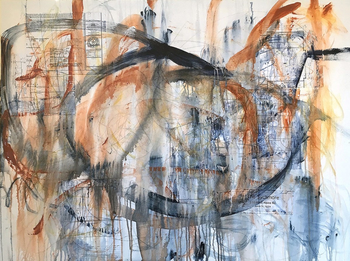
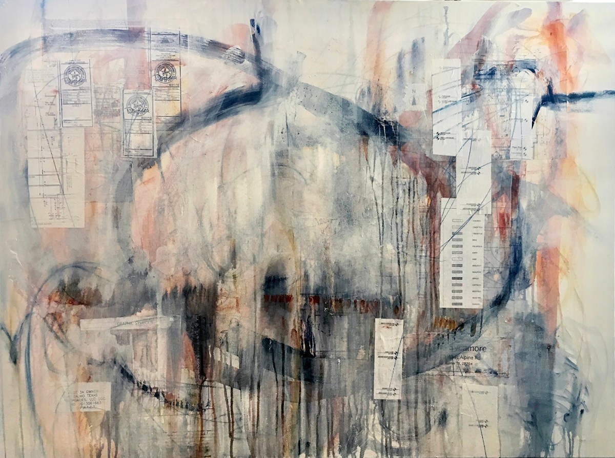
Here is their finished underpainting. I love the way the burnt orange and indigo granulated with the water. Also, everyone makes their own unique marks and I was so excited by the fresh shapes they provided.

These are just a couple of the spots that really stood out to me. I took pictures to remind myself to preserve those spaces as I began to add layers.
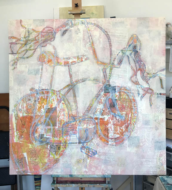
For the second layer, I began to add collage and translucent buff acrylic to quiet things down a bit and help me focus on the magical parts of their underpainting. In subsequent layers (15 or so) I concentrated on composition, continuing to build interest and editing as needed. In some cases, I was able to save their brushstrokes unaltered. In others, I reemphasized their marks as I went along. Some I replicated with my own hand or used photo transfer to move them to an area that worked better with the composition.

I delivered the finished painting while the family was away during the holidays and left the following note for the budding young artists:
Thank you so much for helping me with this work of art! You were excellent at mixing the colors and your underpainting is beautiful. The underpainting is a big part of a finished piece of art. As the first and most important layer, it provides colors that make the painting glow and helps the artist decide where to put all the other marks. It makes everything more interesting by playing a game of “peek-a-boo” with the other layers. It’s fun to look for the places where you can still see the underpainting peeking through. I’ve printed the work you did on the back of this note so you can look for all of your amazing brush strokes and colors.
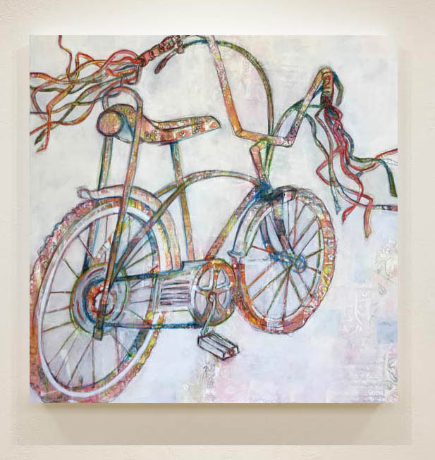
“Family Business” 36″ x 48″ Mixed Media on Canvas